I recently upgraded from Office 2003 to Office 2010 and quickly regretted it. While Microsoft continually makes their programs more visually appealing, very rarely do they add any improvement in functionality, and quite often, things only seem to get worse.
(On a related note, I recently read that Internet Explorer is the only web browser still using a faulty method for interpreting CSS layouts, which is why for the forseeable future, all webpage files will have to begin with an otherwise unnecessary piece of code that does nothing but tell IE to behave properly.)
Anyway, as a scientist, I'm always using error bars. Error bars are a visual way of representing the uncertainty associated with a measurement ... and they are critical for everything we do. No data is meaningful unless one can ascribe an estimate of how close a measured value might be to a true value - a number we can never be totally confident of. So error bars are important. And they keep getting harder and harder to find.
Starting with Excel 2007, functions are organized under "tabs" rather than "menus". More to the point, there are a second set of tabs associated with charts - a tab for the tabs as it were.
When you click the chart, three new tabs appear: Design, Layout, and Format. None of these things sound helpful, they all relate to the appearance of the chart, and not to it's substance. The instinct at this point is to right click on the chart, and possibly look under the "Select data ..." window, but that yields nothing helpful. The error bars are in fact under "Layout". Error bars have nothing to do with Layout, you say? You just haven't learned Microsoft doublethink. You see, "Analysis" is a submenu of "Layout" (why?) and Error Bars fall under "Analysis".
Now, we're ready to add some motherfucking error bars! But, no, wait, none of the error bar options in the drop-down menu are the least bit useful. Standard Error and Standard Deviation might sound useful, but these appear to calculate the SE or SD of all the data in the chart, then assign these same error bars to all the points. (Actually, that was probably the intention, but they seem to have messed that up. Check out what happened when I added Standard Deviation. I don't know what this is, but it clearly isn't what I want.)
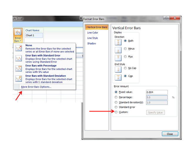
This isn't right at all. Chances are, you need a different error bar for each data point, which you've likely already calculated in a column or row of the spreadsheet. Experienced Excel users know that these are called "Custom" error bars, but they don't appear.
To find the custom error bars, you first click "More error bar options ...", THEN click Custom, at the very bottom of the menu. THEN you have to click "Specify Value".
And open ANOTHER window. Place your cursor in Positive Error Value, delete the placeholder, select the cells containing your error data, and repeat the same process for Negative Error Value. In all likelihood, both error values are the same, but you have to do it all over again anyway.
To my knowledge, there's no way to create a macro to speed this up, and you have to repeat the whole process for every single chart you make, even very similar ones. I realize Excel was never built for scientists. But data is data and error is error. I don't understand why such a simple and useful feature has to be harder to find than that potion in Prince of Persia where you have to knock open a secret ceiling tile and then time a jump through three chompers. It's a just a spreadsheet.


No comments:
Post a Comment